Design System

Rebuilding and revitalizing Opyn’s Design System
Year

2024

My role

UX/UI Designer

Main project goal

Redesign the company Design System to make it accessible to all and scalable

While working on Opyn’s products, we realized that the existing Design System did not meet the product needs. In close collaboration with the development and marketing teams, we laid the foundation for redesigning the Design System.

The problem

Who starts badly ends worse…

The Design System was initially created by an external agency, only focusing on the needs of a single product. The foundations and components were not scalable, and there was a lack of consistency among elements.
It lacked documentation and was entirely missing development guidelines.

The solution

Coming to the rescue of our Design System

After several internal discussions within the Design team, we decided to redesign our Design System to address collaboration issues among different teams and ensure greater consistency between design and developed products.

Building the System

Starting from the foundations, not from the roof
Foundation

Naming conventions

Having clear and semantic naming for each element is crucial; it enhances collaboration between design and development.
We decided to adopt development-oriented terminology for both style elements and components.
Foundation

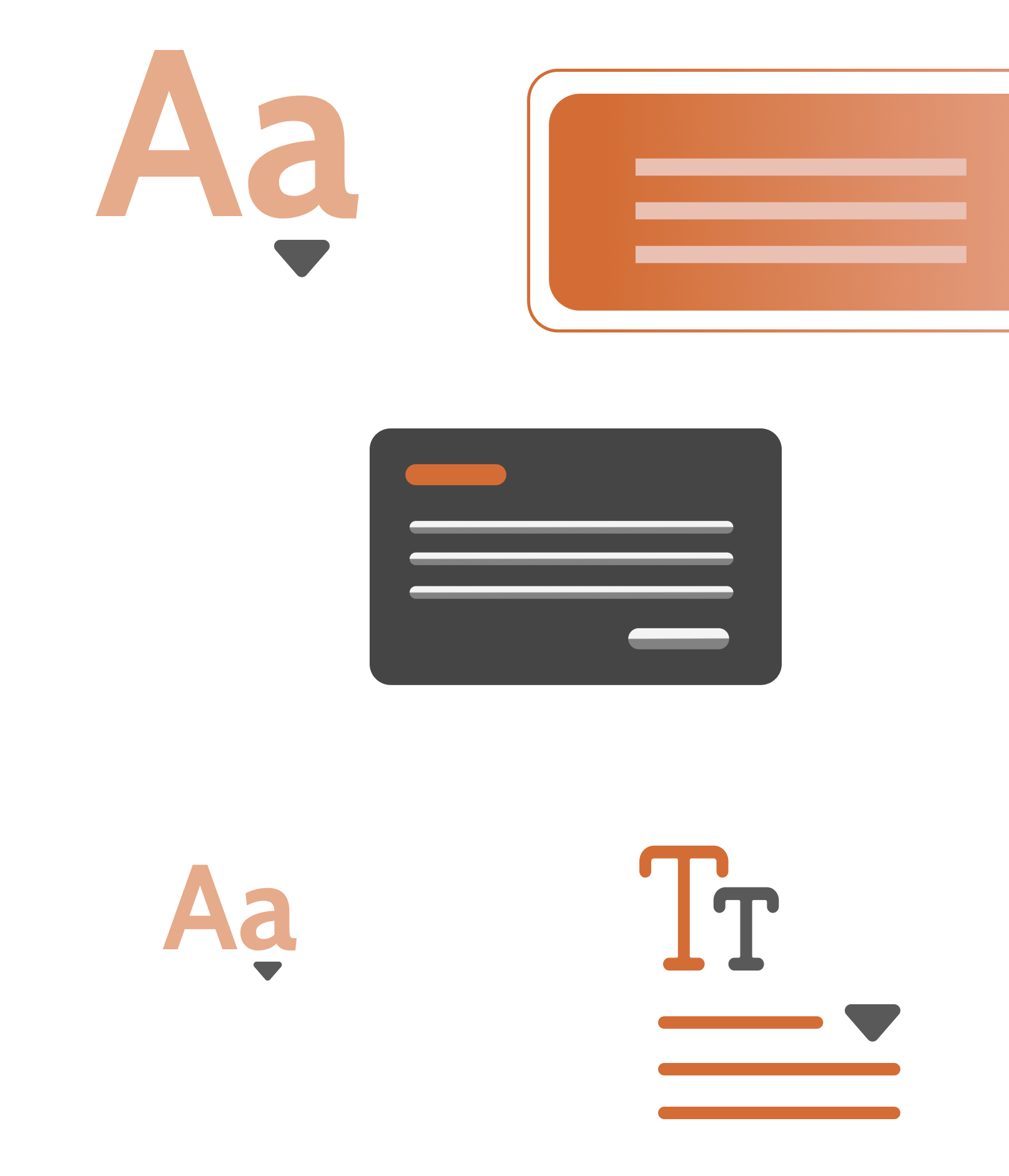
Typography & color palette

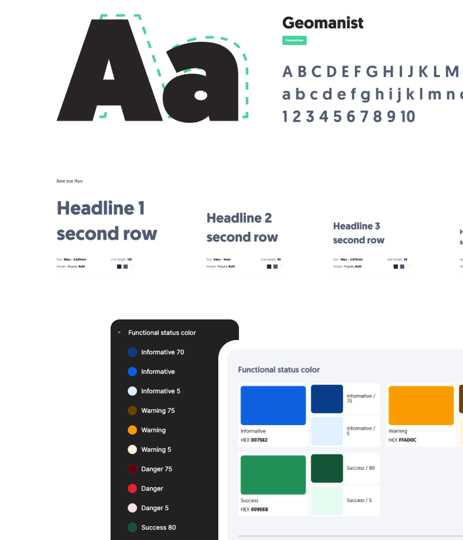
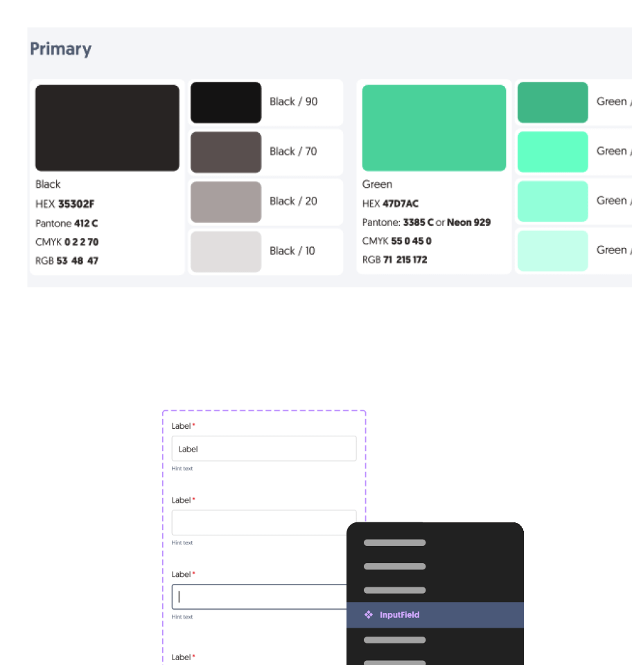
The existing Design System had a solid foundation regarding colors and typography, requiring only minor adjustments.

We added various shades for primary, secondary, and functional colors.

Previously, typography had different sizes for mobile and desktop devices; we adopted a single typographic scale for all devices.

Foundation

Visual

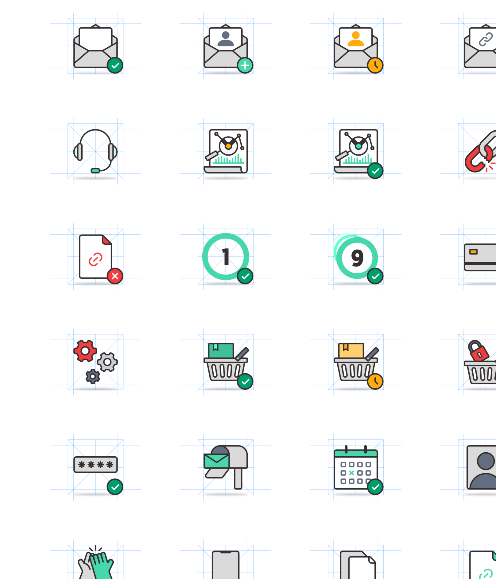
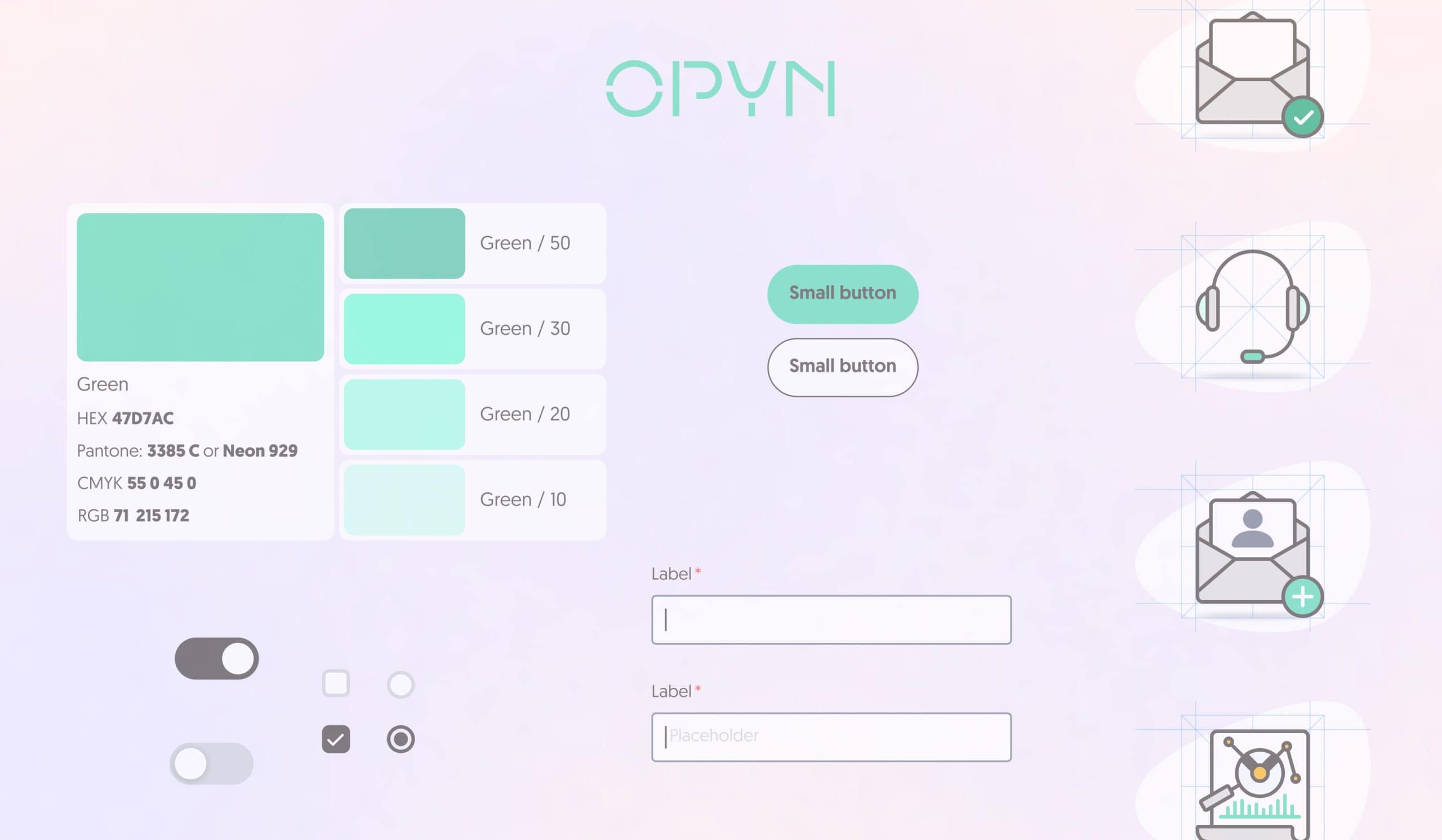
Most illustrations lacked consistency, with varying colors, stroke weights, and dimensions.

We established a grid and standardized these specifications to create a cohesive set of illustrations that effectively support user communication.

Foundation

Spacing system & shadows

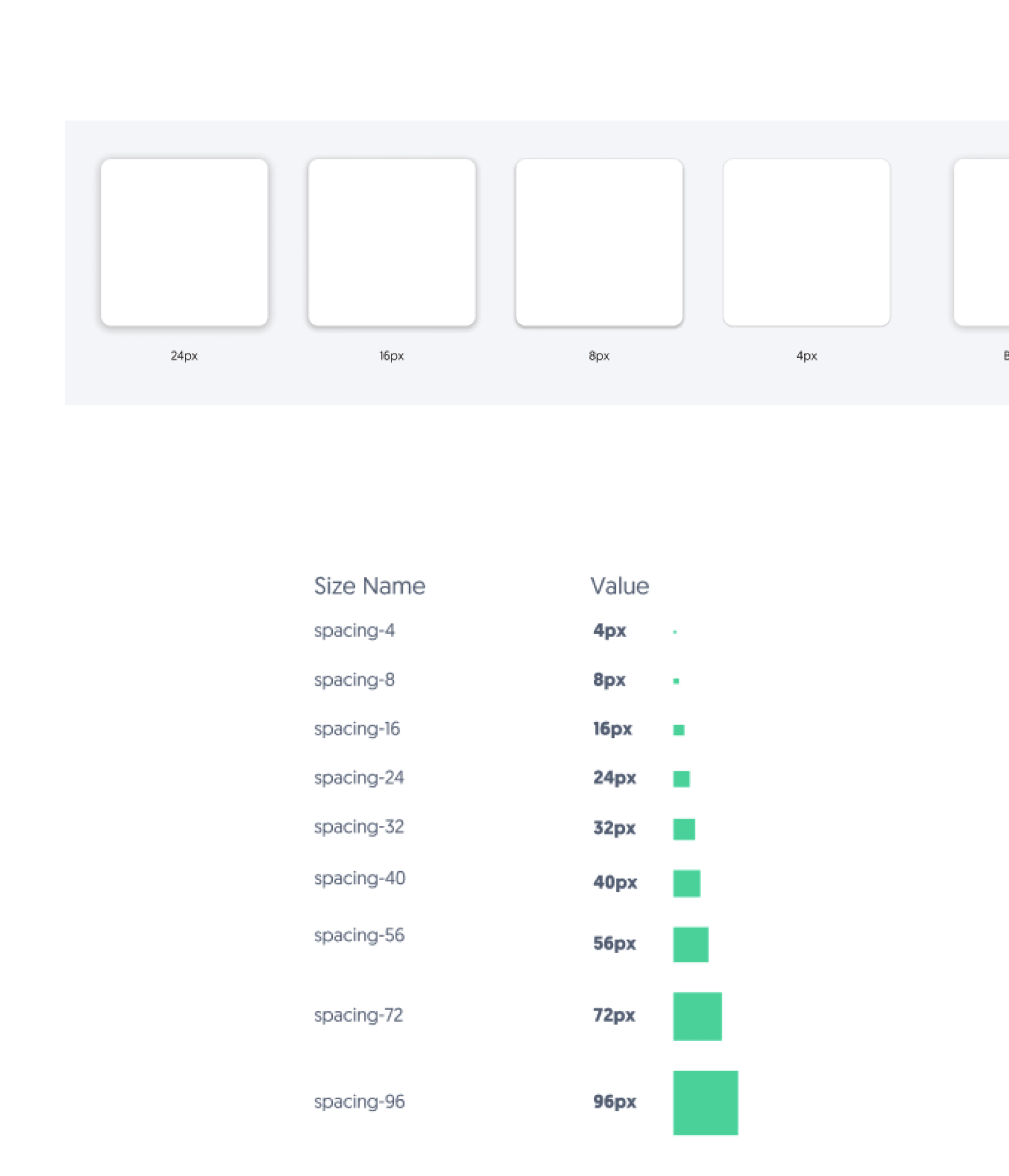
There was no well-defined system for element spacing and padding, not even guidelines for using shadows to convey element elevation against a background.
Foundation

Component Library

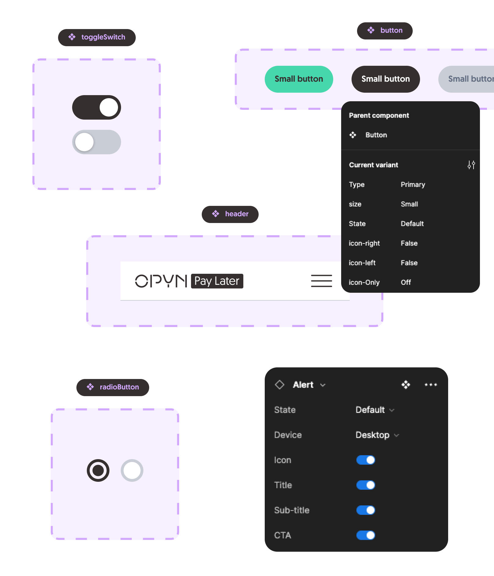
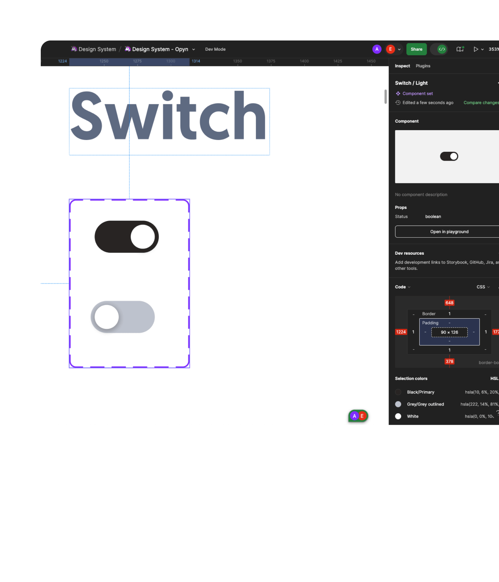
Components represent the fundamental, reusable elements of the interface. They have been designed to meet specific UI needs to deliver a flawless and satisfying UX. Each component has been built using auto-layout, having its own variants and properties specifically created for each use case.
Foundation

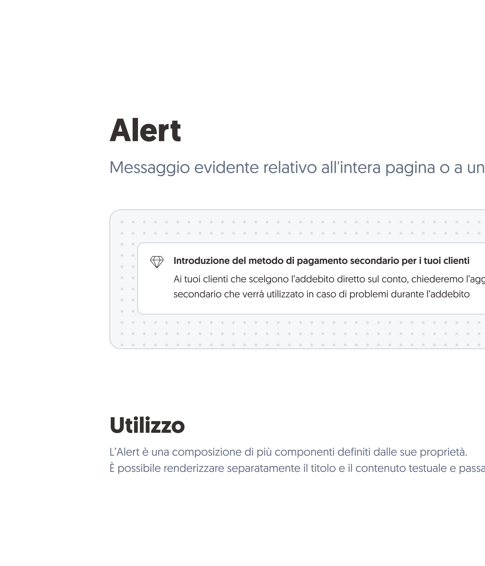
Documentation

Throughout the entire process, we documented all the elements of the design system with the goal of defining all our guidelines.

The documentation includes topics such as breakpoints, icon sizes, text formatting, usage of components and their variants. Additionally, it outlines some allowed and disallowed use cases (dos and don’ts).

Building the System

Starting from the foundations, not the roof

Foundation

Naming conventions

Having clear and semantic naming for each element is crucial; it enhances collaboration between design and development.

We decided to adopt development-oriented terminology for both style elements and components.

Foundation

Typography & color palette

The existing Design System had a solid foundation regarding colors and typography, requiring only minor adjustments. We added various shades for primary, secondary, and functional colors.

Previously, typography had different sizes for mobile and desktop devices; we adopted a single typographic scale for all devices.

Foundation

Visual

Most illustrations lacked consistency, with varying colors, stroke weights, and dimensions. We established a grid and standardized these specifications to create a cohesive set of illustrations that effectively support user communication.
Foundation

Spacing system & shadows

There was no well-defined system for element spacing and padding, nor were there guidelines for using shadows to convey element elevation against a background.
Foundation

Component library

Components represent the fundamental, reusable elements of the interface. They have been designed to meet specific UI needs to deliver a flawless and satisfying UX. Each component has been built using auto-layout, having its own variants and properties specifically created for each use case.
Foundation

Documentation

Throughout the entire process, we documented all the elements of the design system with the goal of defining all our guidelines.

The documentation includes topics such as breakpoints, icon sizes, text formatting, usage of components and their variants. Additionally, it outlines some allowed and disallowed use cases (dos and don’ts).

What’s next for us?

Job finished? I don’t think so…

Cit. Kobe Bryant

Collaboration

Design Team & Dev

Once the redesign is nearly complete, it will be important to share the new Design System Figma file with the developers. They will be involved in discussion about the best method for an efficient handoff. Next, Storybook or similar tools needs to be integrated into this process to bridge the gap between design and development, ensuring alignment between the design element and its code. Documentation will be updated accordingly, with all the necessary guidelines.
Design Team & Content

It is important to have guidelines for content writers as well. We will collaborate with the marketing (content) team to create a guide that includes everything needed to work on contents in a efficient, organized and consistent way. If you have any doubts about how to write a date or communicate an error in the app, this guide will provide the answer.