Emporium

Redesigning the UX of the accounting section
Anno

2024

My role

UX/UI Designer

Main project goal

Enable accounting operations on several current accounts in a usable, intuitive and fast way.

Emporium is a software as a service used to digitise and innovate the credit management of banks, financial intermediaries and companies.

It was born from the need to redesign in a modern way an obsolete software developed several years before 2024. It has been enriched with new features compared to its previous version, the main functionalities have been redesigned adapting to the new UX and UI.

Challenge

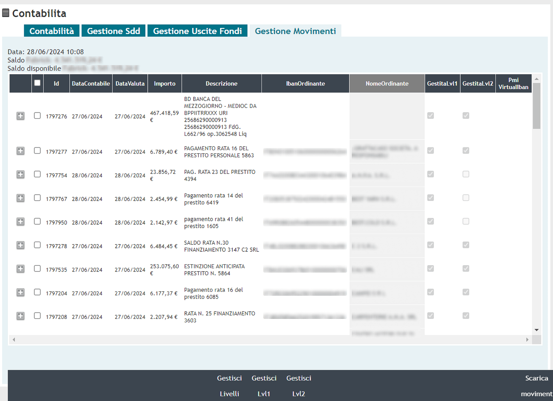
Accounting is still done on the old software, only one current account can be managed.

It will be crucial to integrate all the necessary functionalities in Emporium to allow accounting operations to be carried out, improving the user experience and usability. No less important will be the speed: the numerous daily operations will have to be carried out in just a few steps, minimising the possibility of making mistakes. Make all operations scalable to 15 different bank accounts.
Problem definition

Activity with users

After numerous interviews and shadowing sessions with users, we traced all the operations they perform to complete an accounting task. Several pain points and insights emerged to improve the UX and the new section efficiency.
Points of attention
  • Software is slow, completing an accounting entry takes a long time
  • Difficulty in tracing an accounting entry to its movement
  • It is not possible to carry out more than one operation at a time
  • Automatic control level on some operations to minimise human error
Ideation

Collaborating with the product team, we identified and proposed some ideas on how to improve certain user interactions, using components and design patterns better suited to the new UX. The user journey was refined, by removing no longer available steps.
Our proposals were also shared with the development team, both front-end and back-end, in order to gather confirmation on the develop feasibility of all the functionalities we were designing.

Design

Emporium’s UI was designed using an open source UI Kit, so since all components were already designed and developed, it was not necessary to produce wireframes. The interfaces produced were already hi-fi at this stage.
We focused on solving the main problems that emerged during the research phase.

Managing separate current accounts

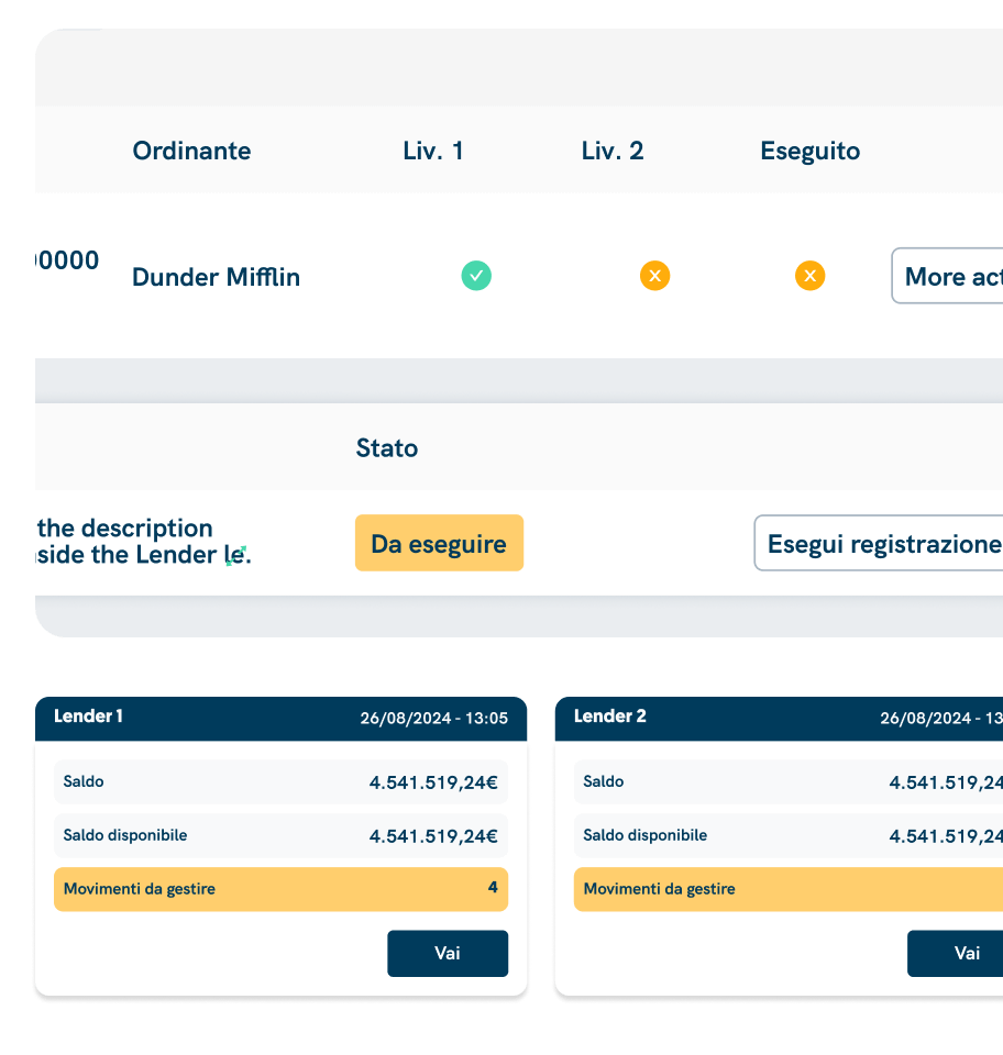
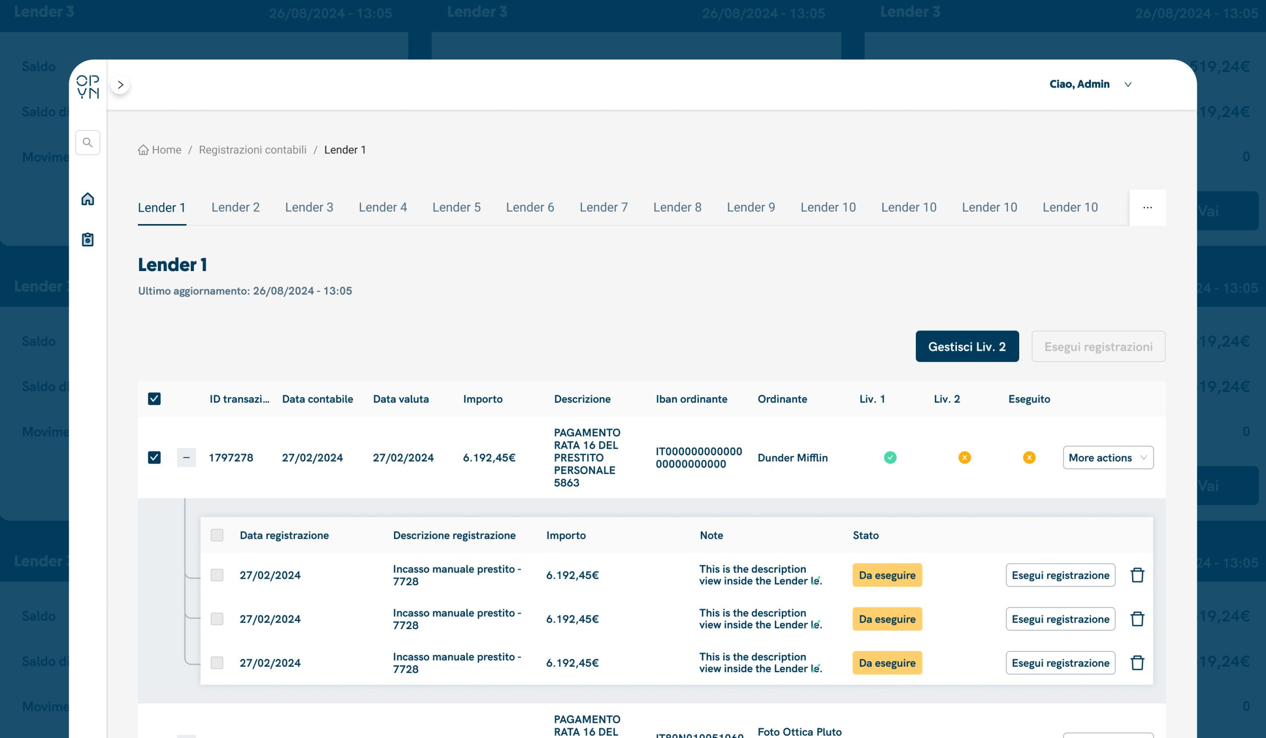
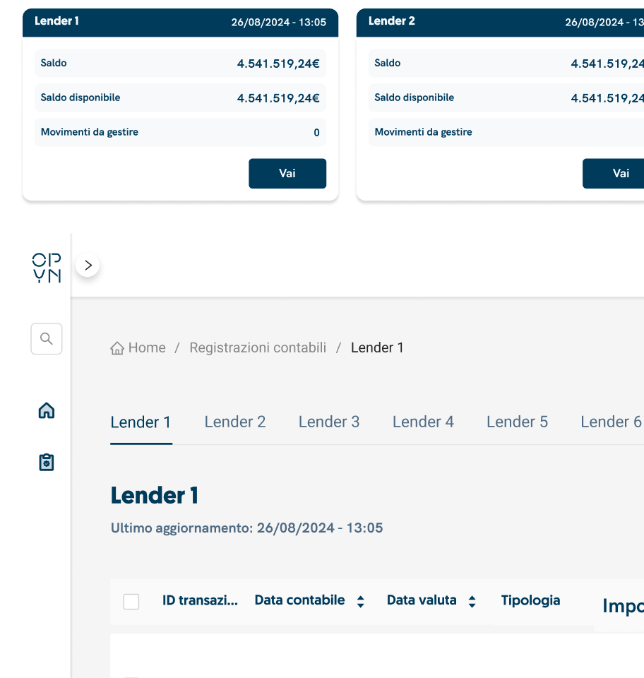
The starting page of the accounts section is a dashboard containing cards which correspond to each current account. All useful informations on the current account is displayed.
Within the details of a current account, a tab list was developed to switch from one current account to another quickly.

Alert system

Clearly highlight, with colours and icons, the accounts that still need to be processed. It is important that all accounting operations are carried out at the end of the day.

Associate accounting entry to movement

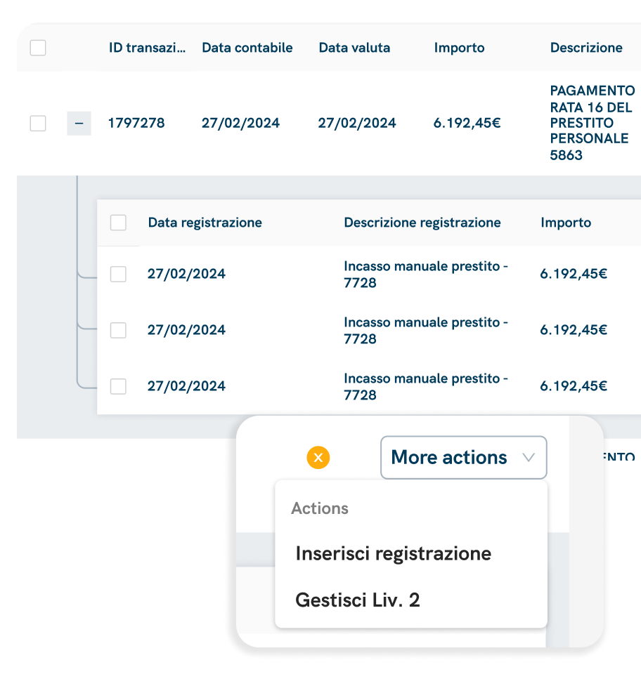
The adding of an accounting entry is done from a movement. It was done in a different tab of the interface previously.
The rows related to movements can be collapsed, displaying within them a nested table with all the accounting records of that movement.

Multiple operations

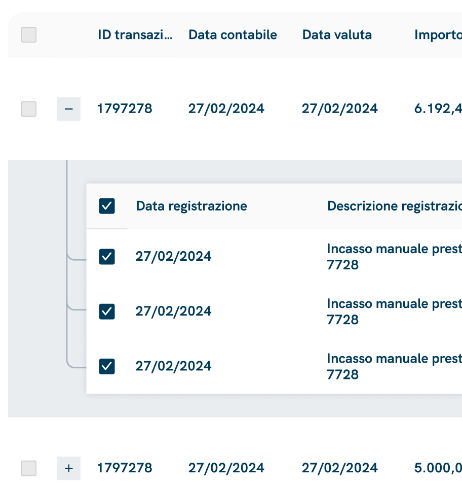
All the major operations can be completed massively.
Addition a check-box at the beginning of a row gives the possibility of performing the same operation on different rows simultaneously.

Automatic validations

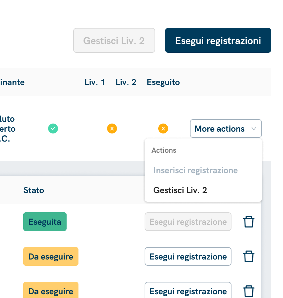
In order to minimise the possibility of errors, numerous validations have been included on the CTAs.
To perform an accounting operation, two levels of control must be satisfied. Disabling CTAs at specific times ensures a specific order during the operations, reducing the possibility of making mistakes.

Testing and iteration

Following technical approval by the development team and a functional verification by the product team, we produced a prototype of the overall user experience.
The prototype was tested with end users, we mainly focused on the interactions and actions they performed spontaneously. The feedback was positive overall, the users were satisfied with the improvements made to the UX and the simplification of the whole process. They only complained about some information that we considered secondary, which was useful for them in order to better carry out the operation.

Final designs

In the four following weeks on tests, the development was divided into two sprints: the first sprint was dedicated to the development of the new back-end structure, insted the second sprint was dedicated to the front-end part. During the first sprint, the user information requested in the test phase was added.